
Create the panel-by-panel color map
Create a simple drawing with each panel labeled and attach the intended color references. Include brim top, underbrim, stitching and adjustment parts. If left and right sides differ, show both explicitly. A palette of three swatches is not enough to define where the colors should go.
Add a simple legend and version date to the panel map, especially if your team is discussing several combinations. A new color reference should update the whole map instead of appearing only in an email note. This prevents one reviewer approving the front from one version and the side panels from another during development.
Balance panel contrast and branding
Choose a dominant color and decide where the strongest contrast belongs. A quieter front makes room for a more detailed logo; a bright front often needs a simpler mark. Review the palette at actual cap scale rather than only as equal-sized swatches. The area occupied by each color changes the overall impression.
Try a reduced two-color arrangement alongside the three-color concept. If the simpler version communicates the identity more clearly, the extra accent may be unnecessary. If the third color is essential, assign it a specific role such as the brim or side panel rather than distributing it across small parts without a consistent visual reason.

Start with the overall proportion, crown shape and artwork scale.
Generated design study; inspect the physical sample before approval.Count complete color-block combinations
Treat each complete panel arrangement as its own colorway in the inquiry. Reversing the positions of two colors creates a different finished combination even when the same fabrics are used. Give each arrangement a short name and quantity so sampling notes and quotation lines can refer to it consistently.
List any shared components explicitly, but keep the finished combinations separate. A single closure color may work across several palettes, while artwork thread may need to change for legibility. Identify those differences in the quotation brief so a visually similar version is not assumed to use exactly the same material and decoration choices.
Inspect color boundaries at the seams
On a color-block cap, panel joins are especially visible. Review the transition lines, side symmetry and the way the colors meet at the brim. Photograph front, side and rear views during approval. Record any panel or thread corrections on the same color map to avoid conflicting written instructions.
Review the cap turning from front to profile, since a color boundary can appear balanced from one angle and abrupt from another. Check top-panel symmetry from above as well. If a color placement needs changing, revise the labeled drawing and mark the affected panels; a verbal instruction to swap the blue can be ambiguous.

Read the back, panel junctions and adjustment or continuous crown.
Generated design study; inspect the physical sample before approval.A practical buying example
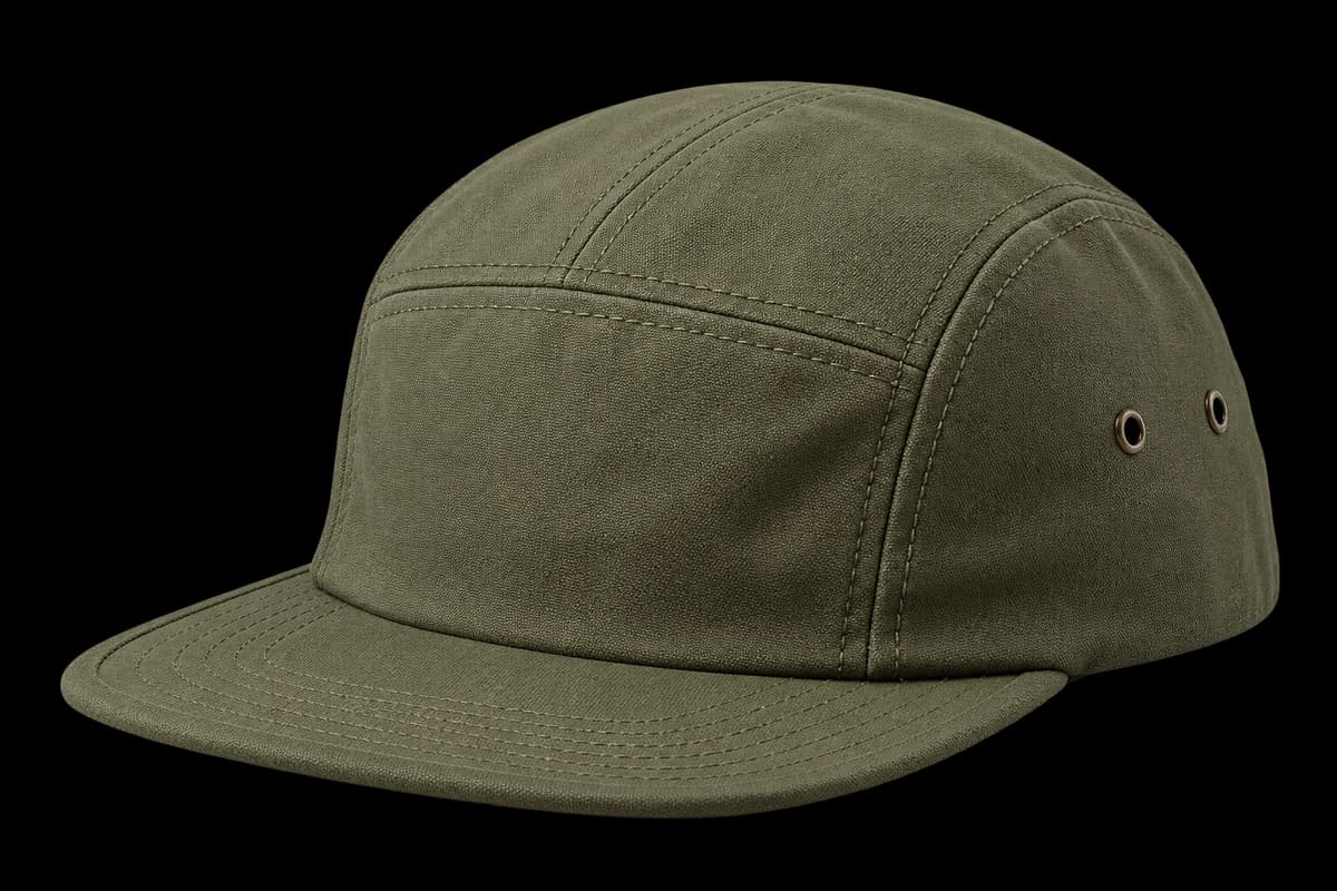
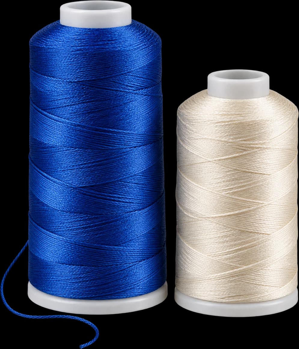
A cream front, olive sides and navy visor form one combination. Swapping the front to navy while leaving the other parts unchanged creates another. Give each a code and record all component colors, including top panels and underbrim. If both are sampled, compare the physical shades together; a palette that works on a screen may look different when curved panels meet.
Questions to settle before requesting a sample
Identify the panel that should draw attention and keep the logo readable against it. Ask whether the chosen fabrics have compatible hand and how their joins look on the assembled crown. Inspect seam boundaries from both sides so color blocking does not hide an uneven panel. Confirm quantities by complete combination rather than dividing a total among individual fabric colors.