
Specify cord size, color and appearance
Do not describe the trim only as a colored line. Include a close reference for its thickness and surface, and state whether it should contrast with or match the brim. Availability, construction and attachment need confirmation before you rely on a particular look in collection planning.
Prepare a fallback trim direction if a very specific rope is central to the moodboard. The alternative might retain the same color relationship with a different visual thickness. State which characteristic cannot change. This supports a useful development discussion without implying that the exact trim in an inspiration photograph is already available.
Balance the rope with the front logo
The rope draws the eye horizontally across the front. A complex mark placed immediately above it can make the composition crowded. Compare a compact badge with a simpler embroidered symbol and choose the one that leaves enough negative space. Judge the relationship at actual size on the curved front.
Sketch the graphic and rope at their intended separation rather than showing them as independent references. A circular badge may need a different gap from a long wordmark. Check whether the rope feels like a frame for the identity or a competing stripe, then adjust one element at a time during visual review.
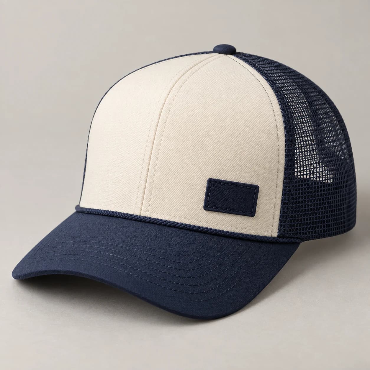
Start with the overall proportion, crown shape and artwork scale.
Generated design study; inspect the physical sample before approval.Inspect cord ends and attachment
Ask the sample review to include views of both rope ends. Check whether the line sits consistently across the brim junction and whether the tension looks balanced. Capture any revisions in marked-up photographs. A front-only approval can miss asymmetry or a finish that is visible in profile.
Look for a consistent curve and symmetrical end placement without pulling the trim by hand for the photograph. Ask to see how the ends meet the adjoining construction. If an attachment detail is visually prominent, decide whether to conceal it more carefully or incorporate it into the design; record the approved approach explicitly.
Keep the complete colorway clear
Front, mesh, brim, rope and logo can quickly become five competing colors. Assign a primary color, a supporting color and an accent role before choosing trims. List every finished combination separately for quotation. If the rope is essential to the design, identify it as a priority in the brief so substitutions are discussed explicitly.
Compare a tonal rope version with a contrasting rope version in the same palette drawing. The tonal option emphasizes surface detail, while contrast makes the accent a stronger part of the cap's identity. Assign a separate finished colorway name if both versions proceed, even when every other fabric and decoration choice remains unchanged.
Start with the overall proportion, crown shape and artwork scale.
Generated design study; inspect the physical sample before approval.A practical buying example
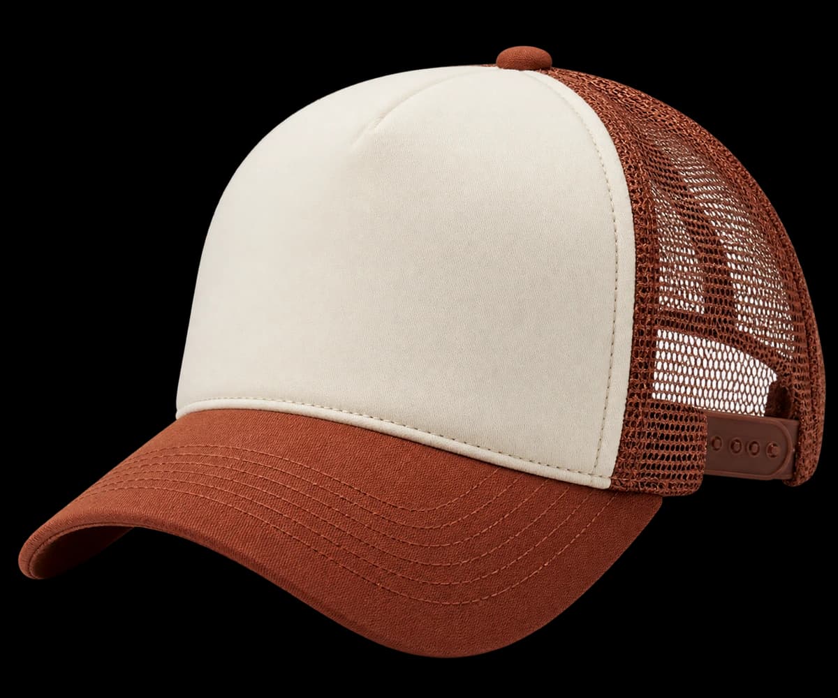
For a cream-front cap with a navy visor, compare a navy rope with a cream one while keeping the logo unchanged. The navy trim makes a stronger horizontal division; the cream trim leaves more attention on the mark. Once the direction is chosen, record the trim reference and attachment. Check both ends on the sample so the visible line does not hide an uneven junction.
Questions to settle before requesting a sample
A rope accent works best when the logo, cord and brim do not all compete for attention. Decide which feature should be read first. Ask about cord appearance at the ends, its relationship to the front seam and the inside finish at attachment points. If the reference rope is unavailable, compare the proposed replacement physically instead of accepting a matching color name as an equivalent trim.