
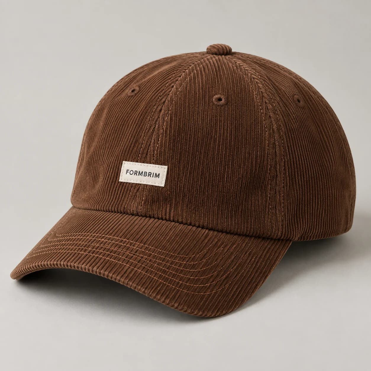
Select corduroy rib scale and fabric hand
Corduroy is not a single surface. Define the rib scale, softness and weight you want to explore. Screen photography emphasizes light and shadow, so the same cloth can look dramatically different under studio lighting. Request a physical fabric review as part of development and distinguish the desired texture from the exact illustrated color.
If choosing between two rib scales, request photographs taken at the same distance with a familiar size reference. Compare each against the intended logo dimensions. A wider rib can make a simple mark feel substantial, while finer ribs may allow the cap to sit more quietly within a collection that already contains prominent textures.
Map rib direction across cap panels
Use a simple sketch to show the preferred rib direction on the front, side panels and brim. Ask which directions suit the proposed pattern and construction. Where ribs meet at seams, decide whether visual symmetry is a priority. This small annotation is more useful than discovering a directional mismatch after decoration.
Check the texture under light coming from the front and then from the side. Directional shadows can make adjoining pieces appear to be different shades. Before rejecting the color match, establish whether the difference comes from the fabric direction. Record both the approved orientation and the color reference in the same material note.

Read the back, panel junctions and adjustment or continuous crown.
Generated design study; inspect the physical sample before approval.Compare embroidery with a woven label
Fine strokes may disappear into a textured surface. Compare a bold single mark with a small woven label if your identity depends on delicate type. Provide artwork at final dimensions and evaluate it on the chosen fabric. The cleanest digital logo is not always the clearest treatment on corduroy.
Consider the boundary around a label as carefully as the lettering inside it. A thick border creates a distinct badge; a narrow border feels lighter but may be less visually separated from the ribs. Compare both at their intended width, keeping placement fixed so the difference you assess is the decoration itself.
Check seam bulk and the rear strap
Inspect the brim join, top button area and adjustment opening where layers meet. Judge the complete cap in wear, including how it sits around the temples. Record any areas that feel too firm or thick and discuss construction adjustments during sample review. Do not approve texture independently of comfort and shape.
Inspect the adjustable strap where it folds back through the closure. If it uses the main fabric, discuss whether the resulting thickness is appropriate to the chosen hardware. Do not assume a closure from a thinner twill reference will produce the same feel. Resolve that pairing before approving the finished rear detail.

Review the inside finish and contact surfaces; the illustration is a proposed construction.
Generated design study; inspect the physical sample before approval.A practical buying example
A narrow wordmark may read cleanly on a screen but disappear into wide corduroy ribs. Compare the intended artwork on the chosen fabric with a woven-label version at the same placement. If the label is easier to read, review its edge and attachment rather than simply enlarging it. Keep the rib direction fixed during this comparison; changing fabric orientation and decoration together makes it harder to identify the useful improvement.
Questions to settle before requesting a sample
Use corduroy when the textile itself should carry part of the design. If the collection depends on very small direct lettering, first establish whether that lettering works on the selected ribs. Request a view of the brim join, top button area and rear strap where fabric layers accumulate. Ask for the fiber specification separately: “corduroy” describes the fabric surface, not its full composition.